One of my first milestone projects is my 300 square foot micro apartment from my Model Building and Human Dimension class. I took this class last year in the beginning of my second year at RIT. I got an A in the end, but I definitely did not start off this class successfully. I remember how stressful my first few experiences with foam core were, how my t-square was seemingly not giving me straight lines and how my foam core cutouts were never able to match the template. The main themes of this course were precision and craftsmanship and I had a lot to learn about cutting straight, clean lines. This was my first project:
I did not design this but was instructed to make it using a worksheet that contained an elevation, some dimensions to scale, and a template. The above picture is AFTER I got an opportunity to raise my grade. The grade I received before I had fixed it was a 6.5 out of 10, which I was extremely unhappy with.
Sometimes it takes me a while to "click", or to rather gain a deeper understanding about what is expected of me and how I can achieve it. When my teacher said something along the lines of "There is no single way to build a model correctly," things "clicked" for me right away. Therefore, the wall that I was having trouble with was no longer a problem, because I realized that I could simply cut it at the seam, shorten it, and glue it back onto the seam. Can you guess where the seam is? It might be easier to tell on this project, but on others probably not so much.
There was another project after the wall project that involved creating a curved wall with a reception desk. The following is also not my original design but was created using a sheet with the necessary information.
This one relied more heavily on bristol board, foam core, and foam. We were also reintroduced to the band saw and the sanding machine and also began to spray paint certain pieces. Looking back, I definitely could have improved, though my grade on this one was not bad at all.
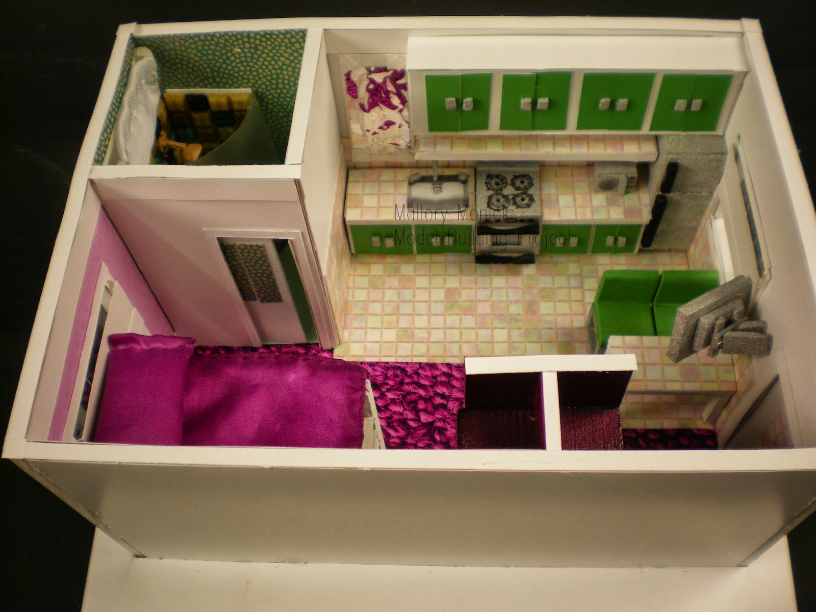
The next and final project for this course (RIT was on the quarter system at the time) had made me realize my hidden passion for this course. We were asked to create a scale model (1/4" = 1'- 0") of a 300 square foot apartment that optimizes all of the space efficiently for a studio apartment, complete with a kitchen, bathroom, and bedroom. We began with sketches but I soon began to create a "sketch model" which helps define what the space will look like in a three- dimensional form. It is a quick way to become oriented with the space without worrying about the craftsmanship:
I then began to select wallcoverings and flooring through patterns in Google, which was allowed for such an introductory course. I soon started to handcraft each piece of furniture in mixtures of foam, foam core, bristol board, and paint. I then realized that I could use other materials such as cloth, clear plastic, and glass mosaic squares.
The class was on Fridays, 9 to 12 then 2 to 5. I soon found myself staying after class to continue working because I couldn't tear myself away. There were one or two nights that I stayed until 10 at night though I really didn't have to. I began sewing the curtain, the blanket on the bed, and the pillow, which I filled with a napkin and then spray painted.
The bedroom area of the apartment was inspired by my dorm room setup, which includes a bunk bed, desk, a box-box-file filing cabinet, and a chair. Though I kept the same measurements, I altered the forms and colors to allow for a more contemporary space.
Since 300 square feet is very small for an apartment, I decided to remove the bathroom sink and instead made the kitchen sink readily available outside the bathroom with a mirror hung above it. The toilet was based off of some modern toilets that do not have a back tank. I handmade the showerplace with mosaic pieces on bristol, bronze-painted foam core, and sanded and heated a plastic sheet to portray a frosted shower door. The pocket door to the bathroom eliminates the need for a door swing clearance, which would take up an extra 3' of space.
Though I could have opted for more flexible furniture such as mattresses and tables that fold into the walls, I decided to stay simple in that aspect. Each piece of furniture was handcrafted except for the kitchen sink which was instead printed out to avoid cutting into the countertop pattern. Cushioned chairs help to make the dining area more comfortable for watching television since there was no space for a living room.

The overhead view helps to demonstrate the amount of space allotted for movement. An open coat closet is available as someone enters the space, and on the other side are larger cubicles for storage needs.The difference in flooring helps define the space without the use of walls or differences in ceiling height. Each window has a sill and is lined with a clear plastic sheet to suggest a window. I spent approximately 30 hours on this project and ended up getting a 95. If I were to fix one thing, it would be to reduce the scale of the carpet. I can honestly say that I had a lot of fun about this project and it also helps demonstrate that when I am frustrated with a project, it pushes me to learn more about how to solve problems so that I can get rid of that stress and almost turn the project into a hobby.


.jpg)