Wednesday, November 27, 2013

Updated Plans

I added more grass and furniture in the Engineering departments. I also filled in the interior walls which help to bring out the boundaries. Grass now has a texture pattern for a clearer visual explanation. The conference table in the large conference room is now rectangular and pushed to one side, allowing for a larger passing area rather than two small passing spaces. Major passage areas are now marked with dimensions.
For my Office Design project, I decided that for my final book that I want each page to be landscape. Therefore, I had to rotate each of my plans and my text as well. I also added titles, a logo, and page numbers for my final book. Both of the following plans have had some revision that help to explain my decisions more clearly.

I changed the symbol for my exit signs as well as for my LED troffer lights. The slash in the symbol helps to differentiate it from the wooden ceiling and acoustical tiles. I added acoustical tile to the kitchenette because it may get loud in there and I would not want to disturb the offices attached to it.

Tuesday, November 19, 2013

Extra Credit

I am going to take a break from writing about my Office Design project and instead write about the extra credit assignment that accompanies it. The assignment requested that I design one room to be my personal interior design office and that it should be 15' x 15'. I decided to do my space planning in Revit since I had been using AutoCAD for my other coursework and felt that I could use a refresher. Revit is nice because it adjusts my text sizes accordingly.
I feel that I have been using too many spring greens, teal, and sky blues, I decided to go for a different color scheme this time, which includes red, yellow, blue, white, black, and gray. I was very excited to render my SketchUp views for this mini project.

Though my ceiling design is simple, I am very happy with its correspondence to the windows and using the colors to create balance on every surface of the space.

Tuesday, November 12, 2013

Office Design SketchUp Views

Creating perspective renderings of chosen spaces in my floor plan help me as well as the client to clearly see my intentions in terms of textures, lighting, and space planning. The following images have been created in SketchUp:
This image corresponds to the Lobby/Reception area that is labeled in my floor plan and reflected ceiling plan. As part of creating branding for Bright Device, I made them a logo that incorporates a sun and grass as well as fresh colors that can be found throughout the space. Since I was asked to create a custom desk, SketchUp helps to show where I intended to place the 3form panels and also how much the counter surface protrudes. This view is not complete since I have not rendered it with the Shaderlight plug-in yet. Shaderlight helps to add lighting and texture to the space. I will also be scaling down the 3form panels so that they look like the actual products.
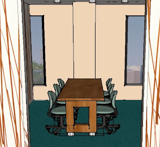
This is a view of the small conference room. I will also be scaling the 3form down on this image as well as it is way too big. I made the "Convene" table in SketchUp but was able to download the Criterion chairs from the 3D Warehouse and simply add the Closed Loop upholstery to it with the paint tool.
This is a view of one of the Engineering desking systems. I am really excited to render it in Shaderlight as it will appear a lot more realistic than it does currently. This view emphasizes the openness of the space because the filing is used instead of an actual wall. It also showcases the large size of the windows and how much light they can let into the building.

Thursday, November 7, 2013

Office Design Reflected Ceiling Plan

I have selected various lights to go into my office design project, which can be found on the specification sheets I have been creating throughout the semester. It is still in progress. There should be no furniture on an RCP, but I use it to help center my lighting over objects such as desks and tables. I erase the furniture as I progress. Below is what I have come up with so far for ceilings and lighting:
I have chosen recessed compact fluorescent lighting throughout the space and then added additional lighting to add interest, such as the chandelier above the reception desk and the track lighting above grass, work counters, and engineering desks. I also chose Armstrong acoustical tiles for places that I felt could use more sound absorption. It is also a way to define a space without the use of walls. Wood ceiling panels are located in the lab and they line up with the track lights and LED troffer lights. I have also places exit signs near the entries though I might decide to move them out into the intersections so that they can be more easily seen from around the corner.

Saturday, November 2, 2013

Sketches and Selections

I created sketches to supplement areas of my floor plan that I thought could use more explanation. Though the sketches are rough they are intended to give the audience an idea of the expected colors, textures, and dimension.
The sketches help to specify where I am going to be putting some of the 3form panels. Since 3form is so versatile, I will not only be using them to divide space but also to create interest on the reception desk and on the kitchen counters. I chose 3form for the countertop since it is unlikely that anyone will be cutting up food at the office.

This sketch refers to my office-garden hybrid concept. Grass will be used as decoration throughout the space and adds interest to the bookshelf. The lobby grass appears higher than it is because the grass leads into a 3form "Bear Grass" panel.

I choose the FrameOne product line for the Engineering departments because they have a slight industrial feel but not enough that it would take away from the natural, sustainable image that is being created otherwise. I also plan to use both shades of Currency in different spaces because they coordinate with the flooring that I have chosen. The Switch coffee table can be viewed in my sketch in the lobby area. Convene is going to be used in each conference room. Bindu chairs and Passarelle seating will be upholstered in a teal faux-leather by Designtex, both of which are shown in my sketches but the colors are incorrect due to my lack of high quality markers. Enea Lottus chairs can be found in the kitchenette because of its relaxed form.
Acoustical wallcovering can be found in areas that require more silence and privacy, such as in Accounting. Carpet tile also provides acoustical privacy because they help absorb sound rather than reflect it. The executive wallcovering can be found in private offices. I also chose vinyl tiles to use throughout the space but after my Materials and Specifications class on Tuesday, I decided that I fell for greenwashing. Centiva tiles may be 100 percent recyclable but dioxin is released when vinyl is manufactured and it is linked to infertility, hormone disruption, and cancer. I would like to find a solution that is recyclable and also doesn't contribute volatile organic compounds to the environment, but also passes slip resistance and flammability testing.
Armstrong acoustical tile can be found in Accounting as well. I chose 2' x 2' tiles because I feel that they look classier and this version also has more of a matte finish. I choose a wood ceiling for the Engineering department because it would line up nicely with the track lights that I have chosen for above the desking systems and counter surfaces. Recessed compact fluorescent lighting will be in most areas but I would like to switch to a LED solution instead. The chandelier and floor lamp are halogens but since I am only using one chandelier and two of the floor lamps, there is not much damage being done.