Wednesday, October 16, 2013

Office Design Colors and Materials

I have been using the internet as well as RIT's material library to choose samples for my office design project. Since I am in the process of choosing lighting as well, I put each sample under natural light plus fluorescent light, and also under natural light plus incandescent light to see how the colors react. I used natural lighting with each because the office space has many large windows. I created a chart listing which upholstery fabric went best with 3form panels, and which paint colors would suit the two together. For example, Designtex's "Chromatic" upholstery in the color "Apple" looked best with 3form's "Cirque" finish and Sherwin Williams' "Irish Cream" paint. Then I placed these combinations under different lighting. Most of my selections looked best under fluorescent light since the incandescent made my cool colors appear to be much warmer. Below are some of the materials that I have selected so far.

3form finishes: Cirque, Ting Ting, Bear Grass
Sherwin Williams Paint: Belize, Irish Cream, Tamarind
Designtex Upholstery: Chromatic- Apple, Chromatic- Pool, Closed Loop- Robin's Egg,
    Closed Loop- Willow, Brisbane- Pool, Delaine- Grass, Delaine- Sea
Wallcoverings: Maharam 005 Straw; Maharam 016 Eucalyptus
Carpet: Flor "Take me Over" in Lime; Tandus "Curly Q" in Bukhara
Faux Wood: Centiva "Queensland Walnut" and "Canadian Maple"


I have used these materials along with chosen lighting and furniture to create an image board. The image board is a refined version of a mood board that includes actual furniture that maintains the atmosphere that the mood board had initially created for the client.

My floor plan is coming together nicely as well. At this point all of the interior walls, millwork, and furniture are in the plan and I am now working out the correct layers, line weights, room dimension labels, and text sizes.

Tuesday, October 8, 2013

Office Design Project Update

As the semester progresses, the plans for my office design are becoming clearer. The mood board and word summary help the client to figure out what the plans are for the project as a whole and how the space will make employees and visitors feel. For this project I created two mood boards that had similar words but different textures and colors. I am only showing the mood board that I chose to use for the project, along with the word summary.
 Some of the materials shown above are eco- friendly materials from Designtex. They include samples that I ordered directly from the company because the feel of a fabric is just as important as the appearance. These are commercial grade fabrics that will last a long time. I know that these products are sustainable and commercial grade because I have created specification sheets for them.
The word summary is a supplement to the mood board and further explains the plans in descriptions and colors rather than pictures. It helps emphasize the idea of an office that allows for collaboration and productivity through the use of open areas and fresh, earthy colors.

The majority of products in the space will be from Steelcase or Coalesse. I am also considering 3-form for its unique space division uses and Centiva for faux-wood, modular flooring. One goal for my project is to use sustainable materials that are recyclable and long-lasting. I will also be using a chalkboard wall surface treatment in public areas to further emphasize the community of the space.

There will be organization throughout the space in regards to department. The major departments, such as general office employees, the sales and marketing team, the finance team, and the engineering teams will all have separate spaces. However, spaces in each department will be either open or closed. Unity will be created through the central point of the lobby area in which each department can be reached. General meeting spaces such as the kitchenette are included as well.

Wednesday, October 2, 2013

My First AutoCAD Project

I learned how to draft at the beginning of my second year at RIT in a class titled Architectural Drawing, or at least that was what it was called in the quarter system. At this point I know basic rules about drafting, and I am excited to learn more because I understand the importance of creating a document that is clear for everyone reading it. Each part of the plans needs to be explained thoroughly because there may not be an opportunity to explain it in-person. Much can be explained by line weights and in the areas that the lines are placed. Dimensioning also varies depending on if the wall material is masonry or not. It is also important to create everything to scale, in this case 1/8th of an inch is equal to a foot.
For this project, I was given the exterior walls for the basement and first floor in a packet and I had to draw it in AutoCAD. I used my architectural scale to get the dimensions before putting the floor plan into the program. Layers were created with different colors and line weights to distinguish exterior walls, interior walls, dimensions, lighting, electrical work, windows, doors, and furniture. Page A1 and A2 are shown dimensioned without furniture, and millwork such as cabinetry does not count as furniture. The kitchen counter and breakfast bar are my original custom designs.

For this project, I was allowed to leave the dimensions on my furniture plans (A3 and A4) but in a real life situation I would turn that layer off so that the plan appears less complicated. For the basement area, I decided to create a recreation room complete with a mini bar, television, pool table, and additional seating. In the first floor plan, I chose furnishings for each room and decided to create a home office rather than a guest bedroom, but this depends on the needs of the client.
A Reflected Ceiling plan shows everything that is touching the ceiling, including interior walls, lighting, and differences in ceiling height. For the basement I chose overhead lighting, which would be ideal for using the pool table. On the first floor, I chose to create focal points using chandeliers in the sunroom, dining room, master bedroom, and the entry. The use of a chandelier near the entry serves to make a good impression on guests. Recessed compact flourescents are used in closets, the garage, hallways, laundry room, and the bathrooms. One thing I would have liked to change is that the smoke detectors should be on the Reflected Ceiling Plan rather than the Switching plan. I also would have used less flourescent lighting since this is cool-colored lighting that makes people look less attractive. Flourescent lighting is cheap and more appropriate for a public school or a shopping center. Since there was no budget for this project I could have used something more flattering.


The Electrical plan shows the placement of outlets, including power and data. There are also more specific annotations for outlets that require more energy which are included in the Legend. Looking back I would have liked to make the symbols larger because some of them have subtle differences. There is also a rule that smoke detectors must be in bedrooms and in hallways.


This part of the floor plan has been enlarged to go into greater detail, and that has been annotated using dashed lines on the original floor plan. Each page, such as A9, should match up with its symbols. These elevations help orient the viewer through different line weights that explain which objects are the closest. The darker the line, the closer the object is.

Elevations help to describe what the original floor plan may not, such as the bookcase attached to the kitchen cabinets, and that the chairs are taller than they appeared to be and have a different shape. It also provides stylistic details such as the leaves decorations on the cabinetry.

My plan for the fireplace was to have a smooth white matte surface with added acrylic, opaque squares in different shades of spring greens. Though the elevation shows the general appearance of the fireplace, one day I would like to put this into SketchUp and render it with appropriate colors and textures.

Friday, September 27, 2013

Frustration = Success?

One of my first milestone projects is my 300 square foot micro apartment from my Model Building and Human Dimension class. I took this class last year in the beginning of my second year at RIT. I got an A in the end, but I definitely did not start off this class successfully. I remember how stressful my first few experiences with foam core were, how my t-square was seemingly not giving me straight lines and how my foam core cutouts were never able to match the template. The main themes of this course were precision and craftsmanship and I had a lot to learn about cutting straight, clean lines. This was my first project:
I did not design this but was instructed to make it using a worksheet that contained an elevation, some dimensions to scale, and a template. The above picture is AFTER I got an opportunity to raise my grade. The grade I received before I had fixed it was a 6.5 out of 10, which I was extremely unhappy with.

Sometimes it takes me a while to "click", or to rather gain a deeper understanding about what is expected of me and how I can achieve it. When my teacher said something along the lines of "There is no single way to build a model correctly," things "clicked" for me right away. Therefore, the wall that I was having trouble with was no longer a problem, because I realized that I could simply cut it at the seam, shorten it, and glue it back onto the seam. Can you guess where the seam is? It might be easier to tell on this project, but on others probably not so much.

There was another project after the wall project that involved creating a curved wall with a reception desk. The following is also not my original design but was created using a sheet with the necessary information.
This one relied more heavily on bristol board, foam core, and foam. We were also reintroduced to the band saw and the sanding machine and also began to spray paint certain pieces. Looking back, I definitely could have improved, though my grade on this one was not bad at all.

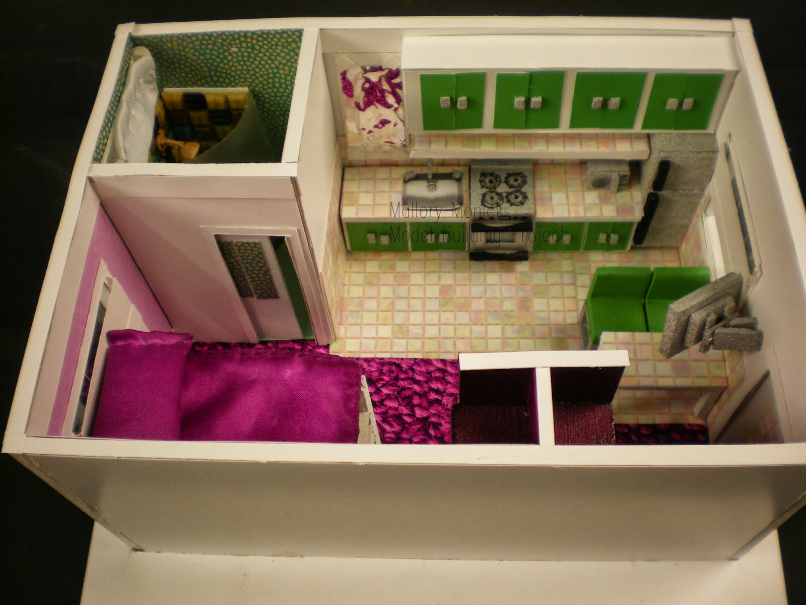
The next and final project for this course (RIT was on the quarter system at the time) had made me realize my hidden passion for this course. We were asked to create a scale model (1/4" = 1'- 0") of a 300 square foot apartment that optimizes all of the space efficiently for a studio apartment, complete with a kitchen, bathroom, and bedroom. We began with sketches but I soon began to create a "sketch model" which helps define what the space will look like in a three- dimensional form. It is a quick way to become oriented with the space without worrying about the craftsmanship:
I then began to select wallcoverings and flooring through patterns in Google, which was allowed for such an introductory course. I soon started to handcraft each piece of furniture in mixtures of foam, foam core, bristol board, and paint. I then realized that I could use other materials such as cloth, clear plastic, and glass mosaic squares.

The class was on Fridays, 9 to 12 then 2 to 5. I soon found myself staying after class to continue working because I couldn't tear myself away. There were one or two nights that I stayed until 10 at night though I really didn't have to. I began sewing the curtain, the blanket on the bed, and the pillow, which I filled with a napkin and then spray painted.
The bedroom area of the apartment was inspired by my dorm room setup, which includes a bunk bed, desk, a box-box-file filing cabinet, and a chair. Though I kept the same measurements, I altered the forms and colors to allow for a more contemporary space.
Since 300 square feet is very small for an apartment, I decided to remove the bathroom sink and instead made the kitchen sink readily available outside the bathroom with a mirror hung above it. The toilet was based off of some modern toilets that do not have a back tank. I handmade the showerplace with mosaic pieces on bristol, bronze-painted foam core, and sanded and heated a plastic sheet to portray a frosted shower door. The pocket door to the bathroom eliminates the need for a door swing clearance, which would take up an extra 3' of space.

Though I could have opted for more flexible furniture such as mattresses and tables that fold into the walls, I decided to stay simple in that aspect. Each piece of furniture was handcrafted except for the kitchen sink which was instead printed out to avoid cutting into the countertop pattern. Cushioned chairs help to make the dining area more comfortable for watching television since there was no space for a living room.
The overhead view helps to demonstrate the amount of space allotted for movement. An open coat closet is available as someone enters the space, and on the other side are larger cubicles for storage needs.The difference in flooring helps define the space without the use of walls or differences in ceiling height. Each window has a sill and is lined with a clear plastic sheet to suggest a window. I spent approximately 30 hours on this project and ended up getting a 95. If I were to fix one thing, it would be to reduce the scale of the carpet. I can honestly say that I had a lot of fun about this project and it also helps demonstrate that when I am frustrated with a project, it pushes me to learn more about how to solve problems so that I can get rid of that stress and almost turn the project into a hobby.


Saturday, September 21, 2013

Office Design Statement


   The following design statement was created for my Office Design class in which we have been given a fake company to provide design services for. It explains the company's image and how I am going to portray that image through the use of materials, furniture, decorating, and architectural choices:

   Bright Device is a small engineering firm that prides itself on the latest technology with an emphasis on sustainability and well- being. Recently their most popular products involve the use of solar power. This company is comprised of 36 individuals including engineers, research analysts, a sales team, management, and university partners such as graduate researchers. These departments contribute to the success of Bright Device as a whole and therefore collaboration is a key resource in day-to- day work. The company has requested that a contemporary, collaborative office be created to emulate their image as a sustainable, safety- conscious engineering firm. This office is located at 1800 Larimer Street in Denver, Colorado on the 19th floor.
   The office will have a sophisticated, bold atmosphere with accents of unique wood finishes and greenery. The large windows allow for the use of various plants and grass as decoration. Since no budget has been specified, only the highest quality of products will be used to emphasize the contemporary image that Bright Device wants to create. Steelcase provides a variety of workstations that encourage community- based projects and an indoor garden will make a great accent to the splashes of color. The unique mix of textures that will be used in the space will encourage free thinking among each department. The open spaces will rid workers of claustrophobia and reduce stress, while the more private areas will encourage individual focus while maintaining comfort. Some spaces will be interchangeable depending on the current needs of each department.
   Bright Device operates on private funding and grants from partnering with its local university. To optimize funding, it is imperative that the office always looks sleek and sophisticated for visitors. Spaces such as the lobby and meeting spaces will be used to keep visitors and potential investors entertained and comfortable. These spaces will be used to showcase past projects and an image of a leader in green technology. High quality seating such as the Jenny Club chair will provide a professional atmosphere that will help the company get the funding that it needs. High quality products prove to be an investment for the future because they last longer and impress visitors. Steelcase products, state- of- the- art technology, and a unique combination of natural elements and contemporary design all work together to create a space that allows for idea development and a comfortable space for workers and visitors alike.

Thursday, September 12, 2013

Just an Art Major, Right?

I go to Rochester Institute of Technology so naturally plenty of my friends are quick to laugh and say "Ha, you're just an art major. You never have work to do". It seems a lot of people at my school don't even know that Interior Design is a major here, and that we even have a club.What some people don't understand is that it's so much more than making things pretty.

First of all, Art is not a bad field to go into. Art is entertainment just like a song or a movie. It provokes thought. It provides a break in a rough day. To enjoy art is to be human. There is art in more than you think, such as the mug you drink from, the clothes you wear, and the shape of your phone. They are all designed to be appealing but also to function. The mug didn't just happen-- it was designed, everything from it's shapes, colors, patterns, materials, and textures were chosen by someone. If you play video games, that's art too.

Walking into a space is really like walking inside an art piece. There is no machine that mass produces entire rooms to be sold on the market. Each space has a personality and may intrigue or bore a person. The subjectivity of it allows for discussion. This discussion is entertainment as well.

Chances are you're sitting at a computer right now, indoors. Do you feel comfortable? Uncomfortable? Do you know why you feel that way? The Environmental Protection Agency states that "Americans spend about 90% of their day indoors". Hopefully 90% of your day isn't miserable. The colors, layout, and textures used in a space can affect one's mood. The amount of natural light in the room has been shown to increase productivity and general well being. Interior Design is art, but it is also psychology. I personally have experienced this, when there were places that I would rather not go into. In high school there was always  one room that made me feel sleepy and I partially believe it to be because the walls were painted with a dull yellow. I prefer to go to Starbucks rather than Dunkin' Donuts because it appears more inviting and doesn't have that fast food image. Interior Design is marketing. Restaurants and hotels bring in more business and can charge higher prices if they have an atmosphere that adds to the customer experience.

ADA requirements assure that the disabled can function in a space comfortably. It's probably not fun to roll up to a reception desk in a wheelchair when the desk 42" high all the way around. Interior designers are also responsible for making sure restrooms and any room is accessible by allotting additional square footage. Interior Design is about accessibility and safety. Building codes and fire codes are created and we have to follow them.

The U.S. Green Building Council has founded Leadership in Energy and Environmental Design, or LEED to help initiate "green" design and a greater Now interior designers are coming up with solutions such as reclaiming old materials and processing them to make new furniture and architectural elements. There is also a focus on reducing or eliminating pollution involved in recent projects.

Interior designers demonstrate the importance of teamwork. Often they work closely with an architect and engineers. Modern office design portrays an emphasis on collaborative work spaces, even with recreational elements to help build the character of a group.

This post is very brief and merely scratches the surface of what Interior Design really is. Here are some links that delve further into the industry:

 http://www.usgbc.org/leed
 http://www.ncidq.org/aboutus/aboutinteriordesign/differencesbetweeninteriordesigndecorating.aspx
 http://www.ada.gov/adastd94.pdf

Interior Design: Because it's what's on the inside that counts!


Friday, August 30, 2013

Back to What I Know Best

I remember when I first applied to Rochester Institute of Technology. There was a page that asked me to choose the top three majors I would like to go into. I chose Nutrition Management first, then Interior Design, and then Spanish. Throughout my entire academic journey starting from Pre-K, I had always been known as an artist by my peers. However, at the time I was not sure if art and design could be more than a hobby for me.

I soon got my acceptance letter that automatically put me in the Nutrition program and I decided to roll with it. I had an interest in Nutrition and thought it would be a great way to help people. I even liked to read up on it at home from time to time. Soon into the first quarter did I realize that I had made a mistake.

As part of the Nutrition program, the freshmen were required to take a sequence of basic Chemistry, Organic Chemistry, and Biochemistry. I was placed in the basic Chemistry class not having any passion for it. My grades were okay in general but were poor for my own standards. I felt like I would be doing better if I enjoyed this kind of work, but I didn't like it and that's just how it is. I knew that if I didn't like basic Chemistry, that I would be continuing a struggle if I decided to stay in the sequence.

I decided to go online and see what other majors were offered at RIT, just to make sure that I won't make another mistake again. Illustration and Metals and Jewelry both seemed like interesting majors for me, but Interior Design seemed to be the best fit. My grandfather was an architect for the Metropolitan Museum of Art and for the Frick Museum as well, so I wondered if design was in my blood. I soon made an appointment with an Interior Design adviser to get my portfolio reviewed.

It was a stressful decision to make this change, but I am glad I did it during my first quarter rather than wait and spend more time and money making up what I missed. I finished my only quarter in Nutrition with a 3.0. I am now a third year student in Interior Design with a 3.55 cumulative GPA. I am not only passionate about my major simply because I love design, but I also want to carry out excellence in the name of my grandfather who I miss very much. I know he would have been proud of me no matter what field I chose and as long as I always tried my best, but this makes it feel even more special. Before he left us he gave me a folder of his old design tools and I still use them to this day.

I will be using this blog to discuss and showcase some of my work, to discuss design concepts that interest me, and to keep a log of my academic progress and what I have learned. I provided some links below.

http://mallory-monick.deviantart.com/
http://www.behance.net/gallery/Interior-Design-by-Mallory/8404307
http://www.linkedin.com/profile/view?id=226455365&trk=nav_responsive_tab_profile