Friday, October 25, 2013

Office Design Midterm Presentation

I began my office design presentation by very briefly summarizing my office statement and then explaining the mood board that I chose and the word summary that supplemented it (which can be viewed in my previous posts). I organized my presentation to flow smoothly by discussing my mood board, then my floor plan, and then my chosen lighting, materials, and furniture. Throughout my floor plan presentation, I often referenced my loose samples so that my peers knew exactly which material I wanted where, what it was made of, what color it was, and the opacity of each material. I also referenced my sketches of specific areas that I thought needed further visual explanation. I will upload those sketches once I can get a better photo of them.

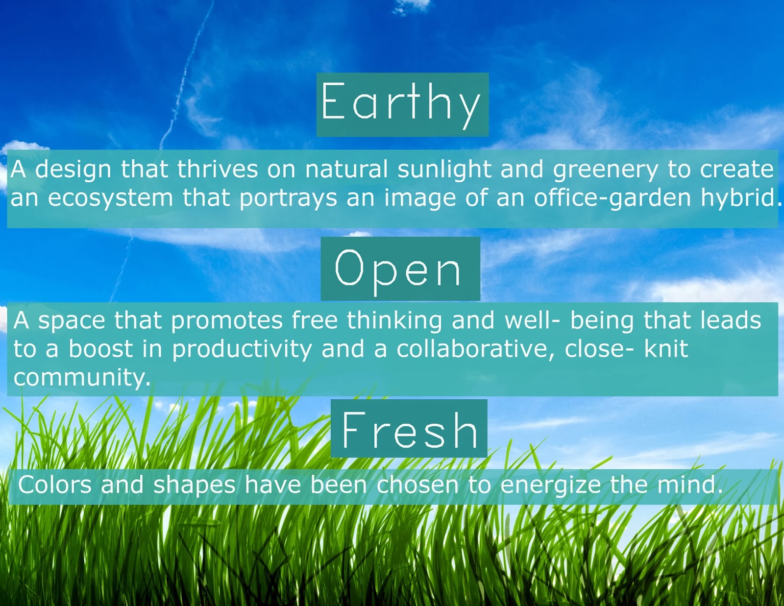
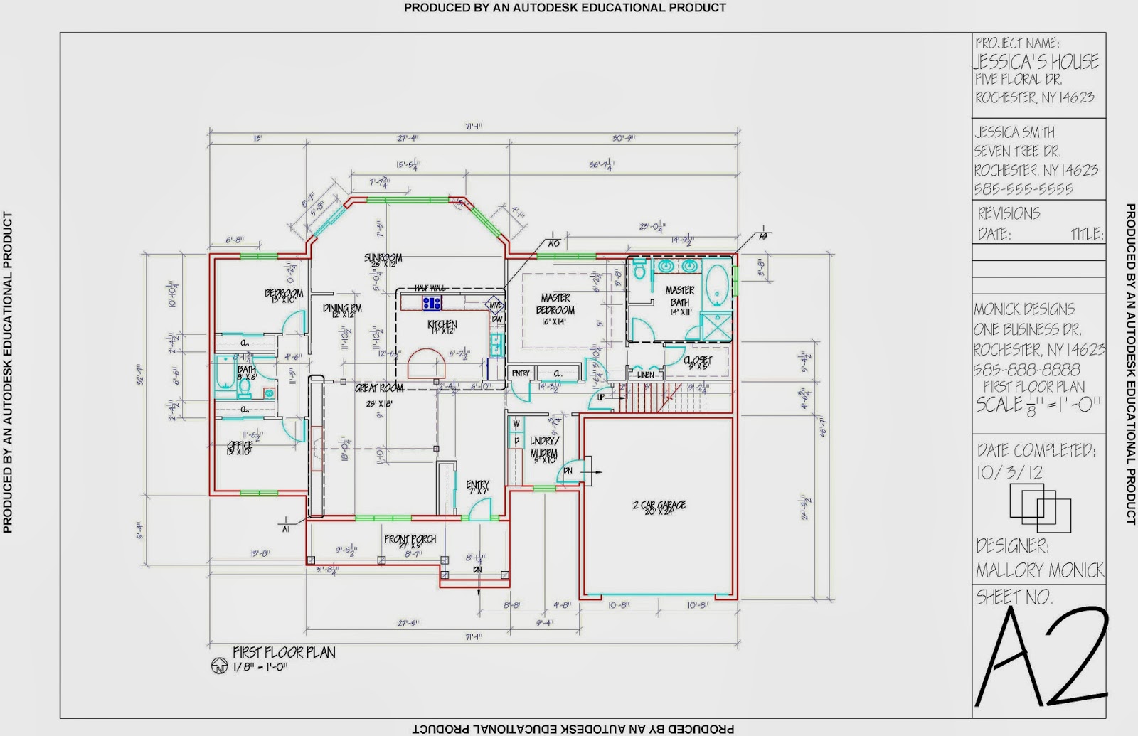
A guest may enter the space from two locations-- one near the reception desk, and the other near the lobby couches. This is to ensure that the guest feel comfortable immediately upon entering and relatively knows where to go even if he or she has never been here before. The space can be divided into three sections, one end is for engineering, the other is for office employees and conferencing, and the middle is a mix of communal spaces and offices. The middle area of the plan includes the lobby, copy room, and kitchenette so that no one office is too far from these spaces that everyone will be using. Though the spaces are divided, they are still open through the use of 3form, which has different opacities that allow one to see through a little bit but not enough to disturb one's privacy. Each of the three spaces uses a different type of 3form panel.

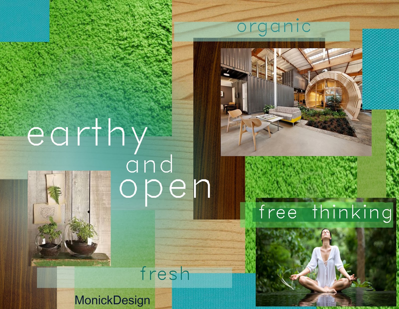
One entry is right near the conference rooms and that allows guests to have easy access to it. The smaller conference room's walls are entirely made of 3form's "Ting Ting" panel, which is meant to make people feel as if they are surrounded by trees. The small conference room also uses sliding doors, as many of the other rooms do as well. Each office has windows to ensure that each employees is getting sunlight to increase well- being. Any spaces that are not against a wall will have 3form panels to let the light stream through, especially for the large amounts of grass that are included in the space to create an office-garden hybrid.

The library includes Steelcase's Walkstation to further promote wellness at work. The bookshelf is also custom-made to provide growing grass on the top shelf. Each space that was allowed to be an open space, such as the CFO and VP Sales, were kept open. The engineering areas were kept open to promote collaboration between both departments.


Wednesday, October 16, 2013

Office Design Colors and Materials

I have been using the internet as well as RIT's material library to choose samples for my office design project. Since I am in the process of choosing lighting as well, I put each sample under natural light plus fluorescent light, and also under natural light plus incandescent light to see how the colors react. I used natural lighting with each because the office space has many large windows. I created a chart listing which upholstery fabric went best with 3form panels, and which paint colors would suit the two together. For example, Designtex's "Chromatic" upholstery in the color "Apple" looked best with 3form's "Cirque" finish and Sherwin Williams' "Irish Cream" paint. Then I placed these combinations under different lighting. Most of my selections looked best under fluorescent light since the incandescent made my cool colors appear to be much warmer. Below are some of the materials that I have selected so far.

3form finishes: Cirque, Ting Ting, Bear Grass
Sherwin Williams Paint: Belize, Irish Cream, Tamarind
Designtex Upholstery: Chromatic- Apple, Chromatic- Pool, Closed Loop- Robin's Egg,
    Closed Loop- Willow, Brisbane- Pool, Delaine- Grass, Delaine- Sea
Wallcoverings: Maharam 005 Straw; Maharam 016 Eucalyptus
Carpet: Flor "Take me Over" in Lime; Tandus "Curly Q" in Bukhara
Faux Wood: Centiva "Queensland Walnut" and "Canadian Maple"


I have used these materials along with chosen lighting and furniture to create an image board. The image board is a refined version of a mood board that includes actual furniture that maintains the atmosphere that the mood board had initially created for the client.

My floor plan is coming together nicely as well. At this point all of the interior walls, millwork, and furniture are in the plan and I am now working out the correct layers, line weights, room dimension labels, and text sizes.

Tuesday, October 8, 2013

Office Design Project Update

As the semester progresses, the plans for my office design are becoming clearer. The mood board and word summary help the client to figure out what the plans are for the project as a whole and how the space will make employees and visitors feel. For this project I created two mood boards that had similar words but different textures and colors. I am only showing the mood board that I chose to use for the project, along with the word summary.
 Some of the materials shown above are eco- friendly materials from Designtex. They include samples that I ordered directly from the company because the feel of a fabric is just as important as the appearance. These are commercial grade fabrics that will last a long time. I know that these products are sustainable and commercial grade because I have created specification sheets for them.
The word summary is a supplement to the mood board and further explains the plans in descriptions and colors rather than pictures. It helps emphasize the idea of an office that allows for collaboration and productivity through the use of open areas and fresh, earthy colors.

The majority of products in the space will be from Steelcase or Coalesse. I am also considering 3-form for its unique space division uses and Centiva for faux-wood, modular flooring. One goal for my project is to use sustainable materials that are recyclable and long-lasting. I will also be using a chalkboard wall surface treatment in public areas to further emphasize the community of the space.

There will be organization throughout the space in regards to department. The major departments, such as general office employees, the sales and marketing team, the finance team, and the engineering teams will all have separate spaces. However, spaces in each department will be either open or closed. Unity will be created through the central point of the lobby area in which each department can be reached. General meeting spaces such as the kitchenette are included as well.

Wednesday, October 2, 2013

My First AutoCAD Project

I learned how to draft at the beginning of my second year at RIT in a class titled Architectural Drawing, or at least that was what it was called in the quarter system. At this point I know basic rules about drafting, and I am excited to learn more because I understand the importance of creating a document that is clear for everyone reading it. Each part of the plans needs to be explained thoroughly because there may not be an opportunity to explain it in-person. Much can be explained by line weights and in the areas that the lines are placed. Dimensioning also varies depending on if the wall material is masonry or not. It is also important to create everything to scale, in this case 1/8th of an inch is equal to a foot.
For this project, I was given the exterior walls for the basement and first floor in a packet and I had to draw it in AutoCAD. I used my architectural scale to get the dimensions before putting the floor plan into the program. Layers were created with different colors and line weights to distinguish exterior walls, interior walls, dimensions, lighting, electrical work, windows, doors, and furniture. Page A1 and A2 are shown dimensioned without furniture, and millwork such as cabinetry does not count as furniture. The kitchen counter and breakfast bar are my original custom designs.

For this project, I was allowed to leave the dimensions on my furniture plans (A3 and A4) but in a real life situation I would turn that layer off so that the plan appears less complicated. For the basement area, I decided to create a recreation room complete with a mini bar, television, pool table, and additional seating. In the first floor plan, I chose furnishings for each room and decided to create a home office rather than a guest bedroom, but this depends on the needs of the client.
A Reflected Ceiling plan shows everything that is touching the ceiling, including interior walls, lighting, and differences in ceiling height. For the basement I chose overhead lighting, which would be ideal for using the pool table. On the first floor, I chose to create focal points using chandeliers in the sunroom, dining room, master bedroom, and the entry. The use of a chandelier near the entry serves to make a good impression on guests. Recessed compact flourescents are used in closets, the garage, hallways, laundry room, and the bathrooms. One thing I would have liked to change is that the smoke detectors should be on the Reflected Ceiling Plan rather than the Switching plan. I also would have used less flourescent lighting since this is cool-colored lighting that makes people look less attractive. Flourescent lighting is cheap and more appropriate for a public school or a shopping center. Since there was no budget for this project I could have used something more flattering.


The Electrical plan shows the placement of outlets, including power and data. There are also more specific annotations for outlets that require more energy which are included in the Legend. Looking back I would have liked to make the symbols larger because some of them have subtle differences. There is also a rule that smoke detectors must be in bedrooms and in hallways.


This part of the floor plan has been enlarged to go into greater detail, and that has been annotated using dashed lines on the original floor plan. Each page, such as A9, should match up with its symbols. These elevations help orient the viewer through different line weights that explain which objects are the closest. The darker the line, the closer the object is.

Elevations help to describe what the original floor plan may not, such as the bookcase attached to the kitchen cabinets, and that the chairs are taller than they appeared to be and have a different shape. It also provides stylistic details such as the leaves decorations on the cabinetry.

My plan for the fireplace was to have a smooth white matte surface with added acrylic, opaque squares in different shades of spring greens. Though the elevation shows the general appearance of the fireplace, one day I would like to put this into SketchUp and render it with appropriate colors and textures.