Friday, September 27, 2013

Frustration = Success?

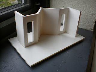
One of my first milestone projects is my 300 square foot micro apartment from my Model Building and Human Dimension class. I took this class last year in the beginning of my second year at RIT. I got an A in the end, but I definitely did not start off this class successfully. I remember how stressful my first few experiences with foam core were, how my t-square was seemingly not giving me straight lines and how my foam core cutouts were never able to match the template. The main themes of this course were precision and craftsmanship and I had a lot to learn about cutting straight, clean lines. This was my first project:
I did not design this but was instructed to make it using a worksheet that contained an elevation, some dimensions to scale, and a template. The above picture is AFTER I got an opportunity to raise my grade. The grade I received before I had fixed it was a 6.5 out of 10, which I was extremely unhappy with.

Sometimes it takes me a while to "click", or to rather gain a deeper understanding about what is expected of me and how I can achieve it. When my teacher said something along the lines of "There is no single way to build a model correctly," things "clicked" for me right away. Therefore, the wall that I was having trouble with was no longer a problem, because I realized that I could simply cut it at the seam, shorten it, and glue it back onto the seam. Can you guess where the seam is? It might be easier to tell on this project, but on others probably not so much.

There was another project after the wall project that involved creating a curved wall with a reception desk. The following is also not my original design but was created using a sheet with the necessary information.
This one relied more heavily on bristol board, foam core, and foam. We were also reintroduced to the band saw and the sanding machine and also began to spray paint certain pieces. Looking back, I definitely could have improved, though my grade on this one was not bad at all.

The next and final project for this course (RIT was on the quarter system at the time) had made me realize my hidden passion for this course. We were asked to create a scale model (1/4" = 1'- 0") of a 300 square foot apartment that optimizes all of the space efficiently for a studio apartment, complete with a kitchen, bathroom, and bedroom. We began with sketches but I soon began to create a "sketch model" which helps define what the space will look like in a three- dimensional form. It is a quick way to become oriented with the space without worrying about the craftsmanship:
I then began to select wallcoverings and flooring through patterns in Google, which was allowed for such an introductory course. I soon started to handcraft each piece of furniture in mixtures of foam, foam core, bristol board, and paint. I then realized that I could use other materials such as cloth, clear plastic, and glass mosaic squares.

The class was on Fridays, 9 to 12 then 2 to 5. I soon found myself staying after class to continue working because I couldn't tear myself away. There were one or two nights that I stayed until 10 at night though I really didn't have to. I began sewing the curtain, the blanket on the bed, and the pillow, which I filled with a napkin and then spray painted.
The bedroom area of the apartment was inspired by my dorm room setup, which includes a bunk bed, desk, a box-box-file filing cabinet, and a chair. Though I kept the same measurements, I altered the forms and colors to allow for a more contemporary space.
Since 300 square feet is very small for an apartment, I decided to remove the bathroom sink and instead made the kitchen sink readily available outside the bathroom with a mirror hung above it. The toilet was based off of some modern toilets that do not have a back tank. I handmade the showerplace with mosaic pieces on bristol, bronze-painted foam core, and sanded and heated a plastic sheet to portray a frosted shower door. The pocket door to the bathroom eliminates the need for a door swing clearance, which would take up an extra 3' of space.

Though I could have opted for more flexible furniture such as mattresses and tables that fold into the walls, I decided to stay simple in that aspect. Each piece of furniture was handcrafted except for the kitchen sink which was instead printed out to avoid cutting into the countertop pattern. Cushioned chairs help to make the dining area more comfortable for watching television since there was no space for a living room.
The overhead view helps to demonstrate the amount of space allotted for movement. An open coat closet is available as someone enters the space, and on the other side are larger cubicles for storage needs.The difference in flooring helps define the space without the use of walls or differences in ceiling height. Each window has a sill and is lined with a clear plastic sheet to suggest a window. I spent approximately 30 hours on this project and ended up getting a 95. If I were to fix one thing, it would be to reduce the scale of the carpet. I can honestly say that I had a lot of fun about this project and it also helps demonstrate that when I am frustrated with a project, it pushes me to learn more about how to solve problems so that I can get rid of that stress and almost turn the project into a hobby.


Saturday, September 21, 2013

Office Design Statement


   The following design statement was created for my Office Design class in which we have been given a fake company to provide design services for. It explains the company's image and how I am going to portray that image through the use of materials, furniture, decorating, and architectural choices:

   Bright Device is a small engineering firm that prides itself on the latest technology with an emphasis on sustainability and well- being. Recently their most popular products involve the use of solar power. This company is comprised of 36 individuals including engineers, research analysts, a sales team, management, and university partners such as graduate researchers. These departments contribute to the success of Bright Device as a whole and therefore collaboration is a key resource in day-to- day work. The company has requested that a contemporary, collaborative office be created to emulate their image as a sustainable, safety- conscious engineering firm. This office is located at 1800 Larimer Street in Denver, Colorado on the 19th floor.
   The office will have a sophisticated, bold atmosphere with accents of unique wood finishes and greenery. The large windows allow for the use of various plants and grass as decoration. Since no budget has been specified, only the highest quality of products will be used to emphasize the contemporary image that Bright Device wants to create. Steelcase provides a variety of workstations that encourage community- based projects and an indoor garden will make a great accent to the splashes of color. The unique mix of textures that will be used in the space will encourage free thinking among each department. The open spaces will rid workers of claustrophobia and reduce stress, while the more private areas will encourage individual focus while maintaining comfort. Some spaces will be interchangeable depending on the current needs of each department.
   Bright Device operates on private funding and grants from partnering with its local university. To optimize funding, it is imperative that the office always looks sleek and sophisticated for visitors. Spaces such as the lobby and meeting spaces will be used to keep visitors and potential investors entertained and comfortable. These spaces will be used to showcase past projects and an image of a leader in green technology. High quality seating such as the Jenny Club chair will provide a professional atmosphere that will help the company get the funding that it needs. High quality products prove to be an investment for the future because they last longer and impress visitors. Steelcase products, state- of- the- art technology, and a unique combination of natural elements and contemporary design all work together to create a space that allows for idea development and a comfortable space for workers and visitors alike.

Thursday, September 12, 2013

Just an Art Major, Right?

I go to Rochester Institute of Technology so naturally plenty of my friends are quick to laugh and say "Ha, you're just an art major. You never have work to do". It seems a lot of people at my school don't even know that Interior Design is a major here, and that we even have a club.What some people don't understand is that it's so much more than making things pretty.

First of all, Art is not a bad field to go into. Art is entertainment just like a song or a movie. It provokes thought. It provides a break in a rough day. To enjoy art is to be human. There is art in more than you think, such as the mug you drink from, the clothes you wear, and the shape of your phone. They are all designed to be appealing but also to function. The mug didn't just happen-- it was designed, everything from it's shapes, colors, patterns, materials, and textures were chosen by someone. If you play video games, that's art too.

Walking into a space is really like walking inside an art piece. There is no machine that mass produces entire rooms to be sold on the market. Each space has a personality and may intrigue or bore a person. The subjectivity of it allows for discussion. This discussion is entertainment as well.

Chances are you're sitting at a computer right now, indoors. Do you feel comfortable? Uncomfortable? Do you know why you feel that way? The Environmental Protection Agency states that "Americans spend about 90% of their day indoors". Hopefully 90% of your day isn't miserable. The colors, layout, and textures used in a space can affect one's mood. The amount of natural light in the room has been shown to increase productivity and general well being. Interior Design is art, but it is also psychology. I personally have experienced this, when there were places that I would rather not go into. In high school there was always  one room that made me feel sleepy and I partially believe it to be because the walls were painted with a dull yellow. I prefer to go to Starbucks rather than Dunkin' Donuts because it appears more inviting and doesn't have that fast food image. Interior Design is marketing. Restaurants and hotels bring in more business and can charge higher prices if they have an atmosphere that adds to the customer experience.

ADA requirements assure that the disabled can function in a space comfortably. It's probably not fun to roll up to a reception desk in a wheelchair when the desk 42" high all the way around. Interior designers are also responsible for making sure restrooms and any room is accessible by allotting additional square footage. Interior Design is about accessibility and safety. Building codes and fire codes are created and we have to follow them.

The U.S. Green Building Council has founded Leadership in Energy and Environmental Design, or LEED to help initiate "green" design and a greater Now interior designers are coming up with solutions such as reclaiming old materials and processing them to make new furniture and architectural elements. There is also a focus on reducing or eliminating pollution involved in recent projects.

Interior designers demonstrate the importance of teamwork. Often they work closely with an architect and engineers. Modern office design portrays an emphasis on collaborative work spaces, even with recreational elements to help build the character of a group.

This post is very brief and merely scratches the surface of what Interior Design really is. Here are some links that delve further into the industry:

 http://www.usgbc.org/leed
 http://www.ncidq.org/aboutus/aboutinteriordesign/differencesbetweeninteriordesigndecorating.aspx
 http://www.ada.gov/adastd94.pdf

Interior Design: Because it's what's on the inside that counts!